Airbus
Next-Generation Cockpit
—
• Role: UX Design Specialist
• Company: Airbus - Cockpit Research & Tech
• Year: 2018 - present
—
THE Context
Pilot shortage and digitalization
The commercial airline industry is facing an imminent pilot shortage, which is compounded by the high cost of training and a steep learning curve. Despite the impact of the COVID-19 crisis on travel, the pilot shortage remains a pressing concern.
Simultaneously, aviation apps designed with consumer-friendly interfaces have become ubiquitous among current pilots during flights. Furthermore, the upcoming generation of pilots, known as digital natives, also reinforces this trend. They are accustomed to digital interfaces that offer an ease-of-use lacking in the traditional cockpit.
Challenge
While researching autonomous flight technology to ease pilot workload, Airbus is exploring a transition from legacy knobs and switches to a streamlined digital glass cockpit.
On the UX Design aspect, the goal is to enhance Human/Machine interaction by adopting patterns from consumer apps and video games.
On the UX Design aspect, the goal is to enhance Human/Machine interaction by adopting patterns from consumer apps and video games.
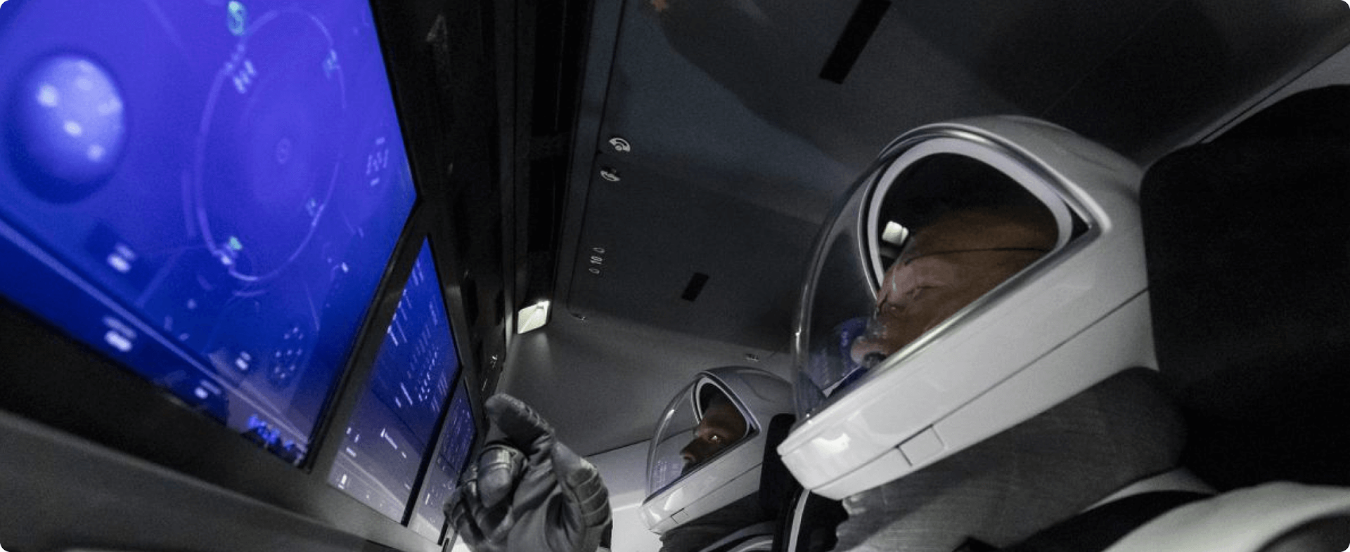
SpaceX Crew Dragon's cockpit HMI is a perfect example of what we aim for.
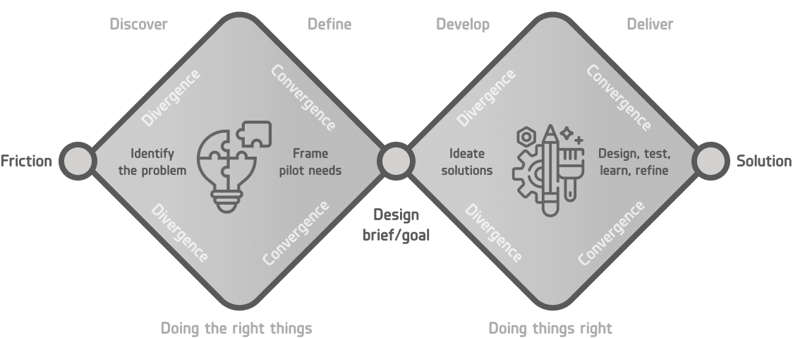
ProcesS
Following the double diamond design process, we work in scaled Agile framework (SaFe), split in several multidisciplinary teams working on specific features and flight operation topics. The design is synched by transversal teams and validated by internal Airbus experts and test-pilots.
—
My role AS UX Design specialist
Next-Gen cockpit
• Responsible and accountable on the Approach and Landing phase design:
• Transversal UX consulting/supporting across all phases and features teams:
Providing usability heuristics expertise and interaction design best-practices. Ensuring the design is consistent through and through.
• Also providing:
Interaction Design voice on cockpit philosophy and CONOPS, individual contribution for the simulator controller HMI design, UI-sound creative direction.
Setting and running co-design workshops involving Flight Operations and Human Factor engineers. Providing interaction design propositions based on needs surfaced during discovery and co-design workshops. Producing prototypes for pre-implementation design validation.
• Transversal UX consulting/supporting across all phases and features teams:
Providing usability heuristics expertise and interaction design best-practices. Ensuring the design is consistent through and through.
• Also providing:
Interaction Design voice on cockpit philosophy and CONOPS, individual contribution for the simulator controller HMI design, UI-sound creative direction.
At cockpit research department level
• Involvement in defining Airbus Cockpit R&T UCD strategy
• UX evangelisation
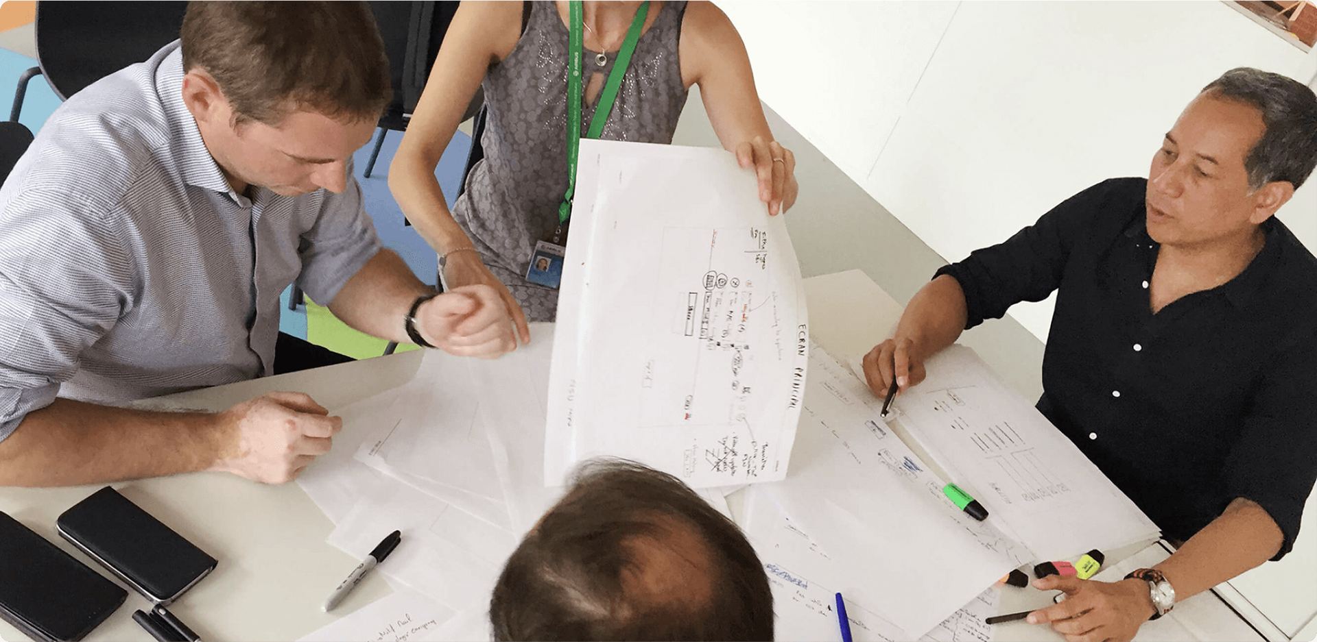
That's me (dark blue shirt) running a co-design workshop with senior engineers on another Airbus project. Any work photos of the actual next-gen cockpit are classified.
—
WORK SAMPLES
1. UX DESIGN
Details on the HMI's information architecture and interaction design are classified.
Details on the HMI's information architecture and interaction design are classified.
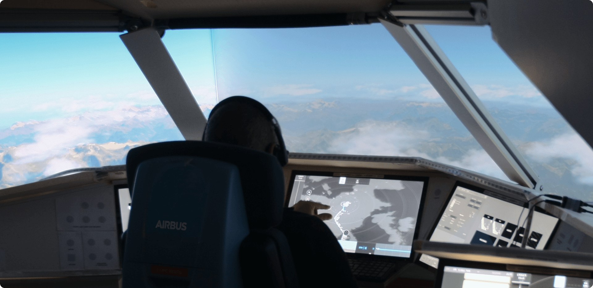
You could nonetheless get an idea of the product with this declassified picture showing the life-sized cockpit mockup (visible on Mines ParisTech's website).
Also, below are some not too revealing discoveries I made while observing testers. I used them as accessibility guidance to position key elements:
• Pilots hands reach and gesture accuracy
When pilots are seated and harnessed according to ergonomics and safety requirements, if their right hand is holding the side stick then they need to stretch their left arm to reach interface elements on the right screen. The same stretch limitation happens the other way when reaching elements on the left screen with the right hand.
When pilots are seated and harnessed according to ergonomics and safety requirements, if their right hand is holding the side stick then they need to stretch their left arm to reach interface elements on the right screen. The same stretch limitation happens the other way when reaching elements on the left screen with the right hand.
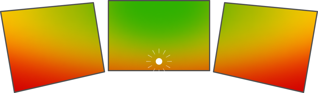
• Pilots' focus of attention
Pilots legitimately focus their attention on the world outside of the cockpit. This draws a focus of attention that centers above the screens. This was the reason testers often missed a key approach indicator (symbolised as a white dot) located at the bottom of the central display.
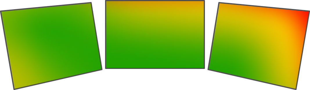
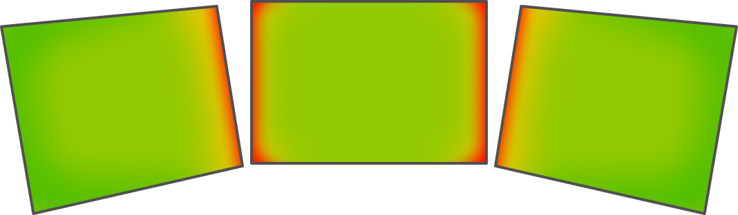
• Cursor travel
The HMI consists of three displays. When using the KCCU ('cursor and keyboard' in aerospace jargon), interface elements at the screen edges and corners were the easiest to access. This is because the cursor can't travel beyond the screen. On the other hand, elements along the open edge (the red zones) were easily overshot since nothing obstructs the cursor's movement.
The HMI consists of three displays. When using the KCCU ('cursor and keyboard' in aerospace jargon), interface elements at the screen edges and corners were the easiest to access. This is because the cursor can't travel beyond the screen. On the other hand, elements along the open edge (the red zones) were easily overshot since nothing obstructs the cursor's movement.
2. UI DESIGN
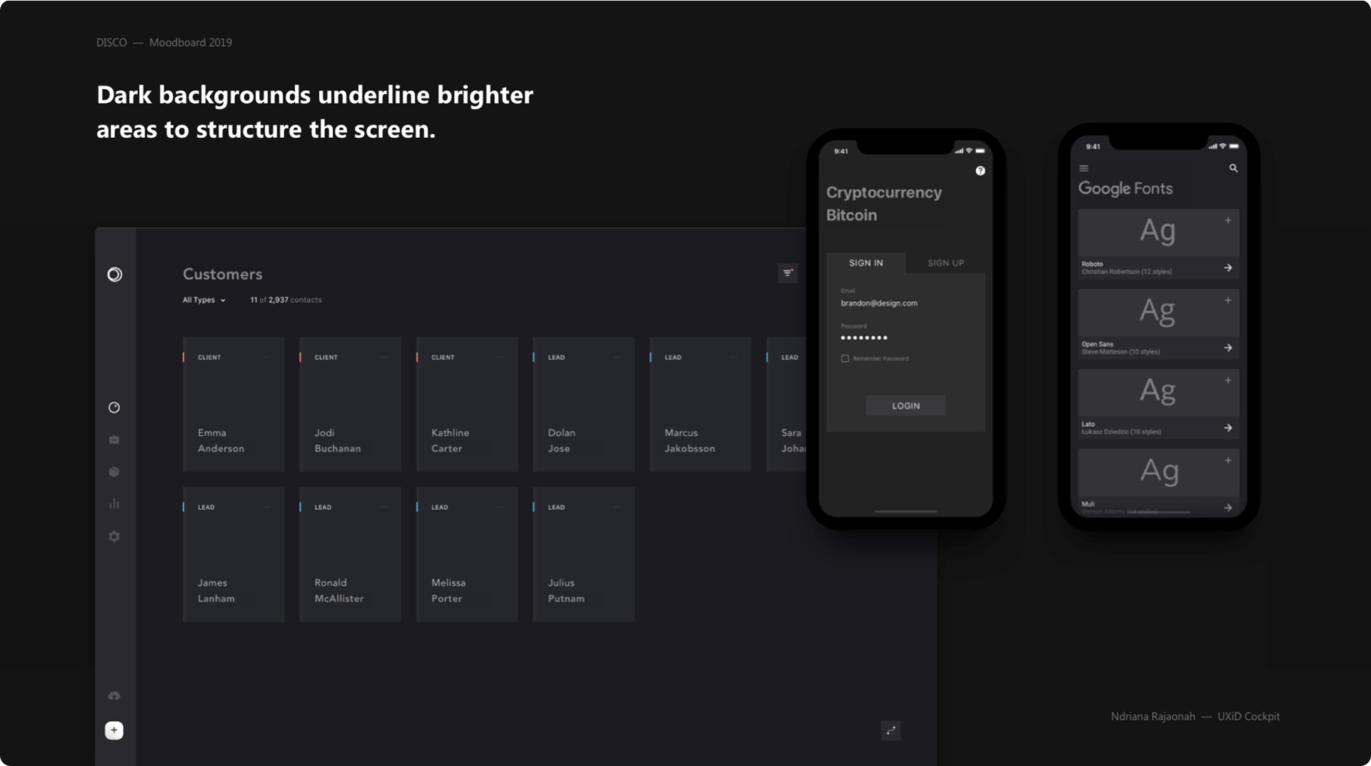
Part of my role in the transversal team involves defining the visual aspect of the interface. My proposition maintained the grey colour scheme of the previous version (as seen in the picture above).
I brought however two drastic changes:
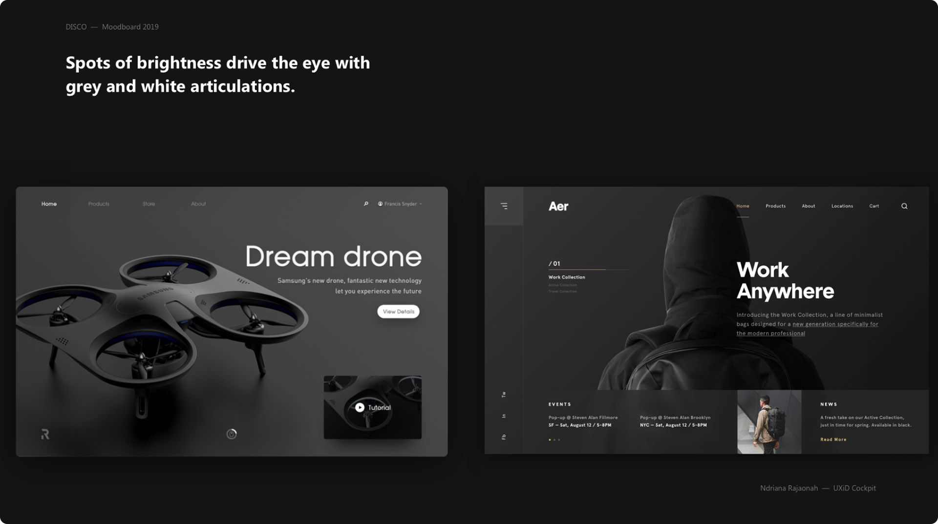
• I introduced subtle elevations to move away from the absolutely flat-design style. This helps differentiating the various groups of information at a glance.
• I pushed for darker greys along bolder highlight colours. This is to create more contrast between the background and key informations.
I brought however two drastic changes:
• I introduced subtle elevations to move away from the absolutely flat-design style. This helps differentiating the various groups of information at a glance.
• I pushed for darker greys along bolder highlight colours. This is to create more contrast between the background and key informations.
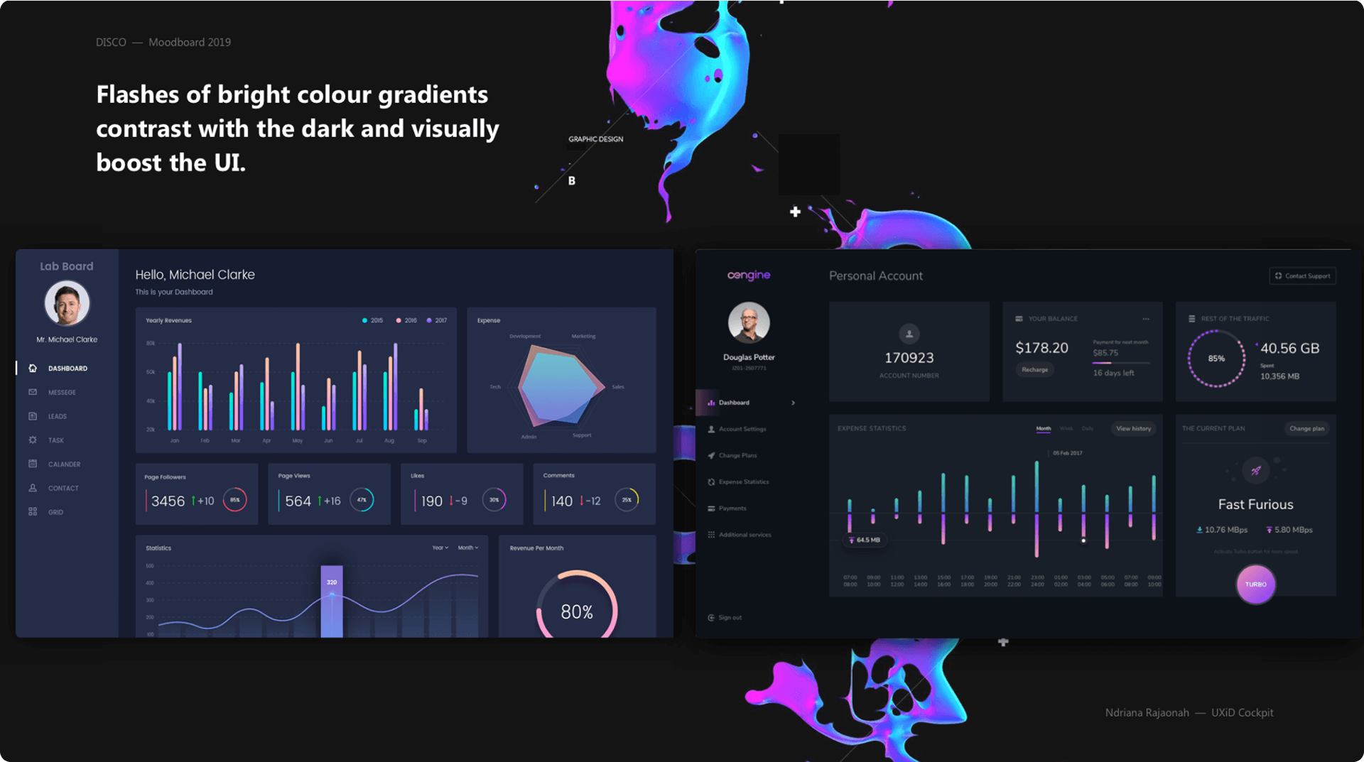
I also introduced subtle visual effects like glows to simulate the legacy cockpit’s buttons illuminated on/off states. Again, the flat design style created ambiguity on this crucial aspect of the UI usability.
• Key slides of the proposed mood board presentation:
• You can view the entire visual research done for this mood in this Miro board ✨
—
WHAT I AM LEARNING
Mission-Critical Interface and Enterprise UX (eUX) are categories of products design I didn’t explore before. As always, the goal is about erasing frictions, preventing errors, ensuring clear feedback and affordance. What changes from consumer products and video-games is the total emphasis on the functional aspect.
Pilots don’t need to romanticise their experience like sports car drivers. They don’t need to feel immersed like gamers either. They have no time for that, they are already living the dream, they are already in a real life adventure, they want efficiency.
Also, pilots are end-users but they don't chose and purchase their own plane. The cockpit is a workplace. Pilots want an informative and perfectly usable interface first before any aesthetics. This goes to remind that, after all, the K.I.S.S. Principle so popular among the design community was coined by Kelly Johnson, an aeronautical engineer.
To be continued...
—
Thanks for reading!