DREADNOUGHT
Spaceship Combat Simulator
• Role: Lead UX Designer
• Platform: PC and Playstation 4
• Company: Yager Studio
Year: 2016
The Context
About the product
Dreadnought is a F2P AAA space combat simulator in which players embody commanders of capital battleships. There are five unique ship classes from three distinct manufacturers, each with their unique drawbacks and advantages. The gameplay involves ship customisation and fleet management besides fleet battles. 
Dreadnought is several digital products in one. It features: 
• a Heads-Up-Display (HUD) providing ship and weapons status, navigation and environment awareness, 
• Vehicles' parts and cosmetics customisation, 
• eCommerce through in-game shops, 
• In-game finance and resources management, 
• Quantified-self dashboard for player performance analytics, 
• Social interaction through in-game friending and group forming (called "squads")
• A multi-channel chat system.
The game has been in development three long years before I was hired. Built with the Unreal Engine, supported by a brilliant art direction, it landed among the most gorgeous games in the industry. It amassed a solid fan base right from announcement despite many competitors.

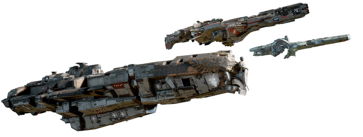
Corvette concept-art by Yuriy Mazurkin.

Aside from ships, players could also customise their characters appearance and garments.

CHALLENGE
Early development priorities allowed little care to Dreadnought's UX/UI. Without UX Designers in-house, the Game Designers acted as the interaction design team. While skilled at building game mechanics, their limited knowledge in usability heuristics translated in many UX frictions.
ProcesS
Each game feature had a dedicated team, we tested several production methods and somehow settled with our own blend of Agile SCRUM and SaFe. 
Design was based on:
• Qualitative insights through daily user-testing (a.k.a playtests)
• Qualitative insights through one-to-one user interviews
• Quantitative insights through the game client usage data
• Insights through players' feedback (through social media, forums, etc)
• Additional data from the Business Intelligence team

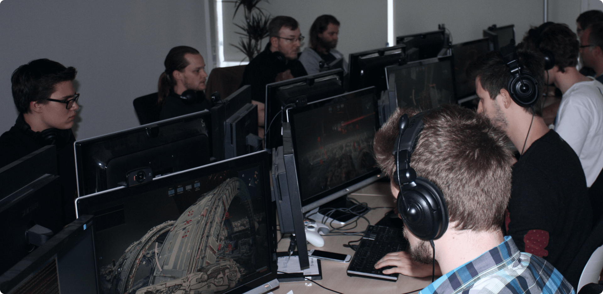
Designers and developers alike had their share of feedback during the daily playtests

My role 
leadership on : 
• Information Architecture: distributing content accross user-journey on key points and organizing content hierarchy per-screen,
• Interaction Design: HUD indications, weapon activations, ships and characters customisation, ship energy management, purchase flow, 
• UI Art Direction: visual, animations and effects styles, personal contribution on key UI elements, 
• Other UI usability and accessibility topics: access-keys policy, UI layering hierarchy, UI colour coding,
across three studios:
• Yager (PC version)
• Iron Galaxy (PS4 version)
• SixFoot (cross-platform monetization)
 
In charge of :
• UX/UI team grooming: face-to-faces reviews and mentoring.
• UX/UI designers hiring process: design-test definition, tests reviews, remote and in-person interviews.
• UI implementation follow-up: closely cooperating with the UI Engineer team to ensure implementation is by design.
Individual contribution :
• Main screen navigation bar UI art (to set the global UI art direction)
• Progression tree UI art (on top of interaction design)
• Propositions for new gameplay features
• UX evangelisation
Coordinating with :
• The Game Director 
• The Lead Game Designer
• The Lead UI Engineer
• The User Research and Business Intelligence team
• The Executive Producer and Game Producers
• Publisher-side stakeholders
OUTCOMES

Dreadnought’s reviews were amazingly positive on its release despite many UX refinements not shipped yet. The ones we were able to implement already had their effect. 
IGN gave Dreadnought 7.4/10 to the PC version
Metracritic gave 72/100 to the PS4 version
CGM gave 8/10 to the PS4 version
Not much was said about the closed and open beta UX/UI. The only negative critics were mostly on other aspects of the game and I took that as compliment. As Jared Spool said: "good design, when it's done well, becomes invisible. It's only when it's done poorly that we notice it."

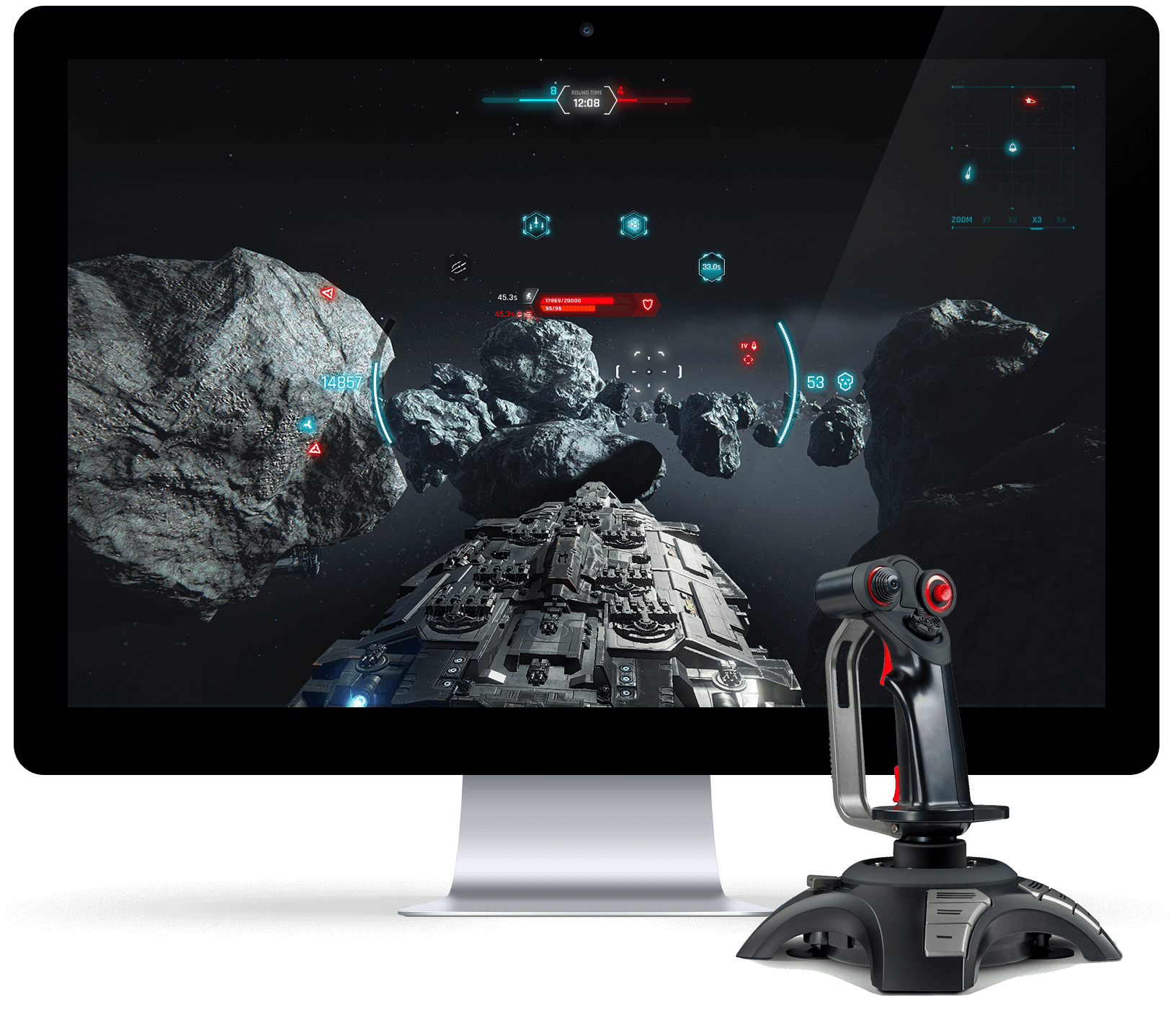
One of the many battle HUD design explorations

WORK SAMPLES
The following documents are a few of the many deliverables I created to share concepts and systems ideas. They are the output of an iterative observation/design/test/execution process.
1. INFORMATION ARCHITECTURE: 
The HUD is the pivotal feature of a combat simulator. However, Dreadnought's closed-beta version missed to clearly translate some information. For instance, to not clutter the screen, hull and energy states are not displayed on the target trackers of distant ships. This came with the downside that players in support ships had to travel within range and roll their crosshair on every single friendlies to find out who required help. Below is one of the wireframes of the new version followed by descriptions of some of the new features:
• Weapon effectiveness on ship locators
This indicator appears on enemy ships as soon as they enter the range of the weapon selected at that moment. It mirrors the crosshair visual evolution. Thus players know at one glance which ships are within the selected weapon range and effectiveness before even moving their crosshair.

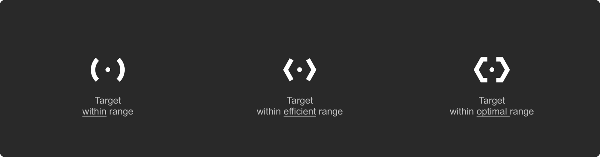
The effectiveness indicators are essentially icon versions of the crosshair states
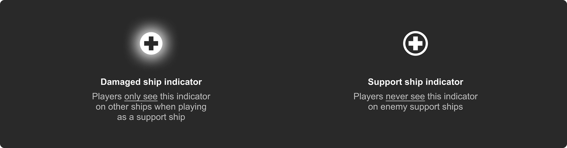
• Support ships in the HUD
When flying a support ship, the HUD indicates all damaged friendlies in need of help with a glowing cross. Whereas when flying in any other ship, allied support ships are indicated with a cross icon. This is particularly necessary  
Other details of the HUD redesign
1) Zero point: shows where the camera is facing. Placing enemy ships under it calls the target marker. 
2) Crosshair: points where guns are directed to, automatically aligns with the Zero point as players rotate the camera angle. Its visual aspect gets additional details as weapons effectiveness evolves from minimal to optimal.
3) Indicators for primary and secondary weapons: shows weapon in use and ammunition countdown until reloading. The name of the mounted weapon (e.g. Heavy Flak) appears briefly on activation.
4) Gun traverse and depression limitation: a visual indicator which fades-in only when the camera angle and the crosshairs gets beyond the gun’s limit. It remains visible until the gun aligns with the camera.
5) Hull structure gauge: shows the ship’s remaining health points, complete with numbers and percentage. It allows players to quickly assess the ship’s structural integrity.
6) Buff/Debuff indicators: shows which buffs and debuffs are affecting the ship and how long (timer countdown).
7) Power gauge: shows the ship’s remaining core energy remaining points, complete with numbers and percentage.
8) Energy allocation indicator: show which of the engine thrusters (speed icon), defense force shield (shield icon) or the weapon system (skull icon) are getting extra boost from the ship’s core energy.
9) Mounted Attack/Defense modules: shows which modules are currently mounted on the ship. They automatically activate and ready up when conditions (e.g. range or incoming missiles) for their usage are detected.
10) Ship surroundings: pinpoints where friendlies and enemies detected by the radar are located, using the player’s ship as the central point. It only shows ships outside of the camera's viewport.
11) Friendly ship within viewport.
12) Enemy ship within viewport (and within the selected weapon’s range in this case).
• Attention distribution balance
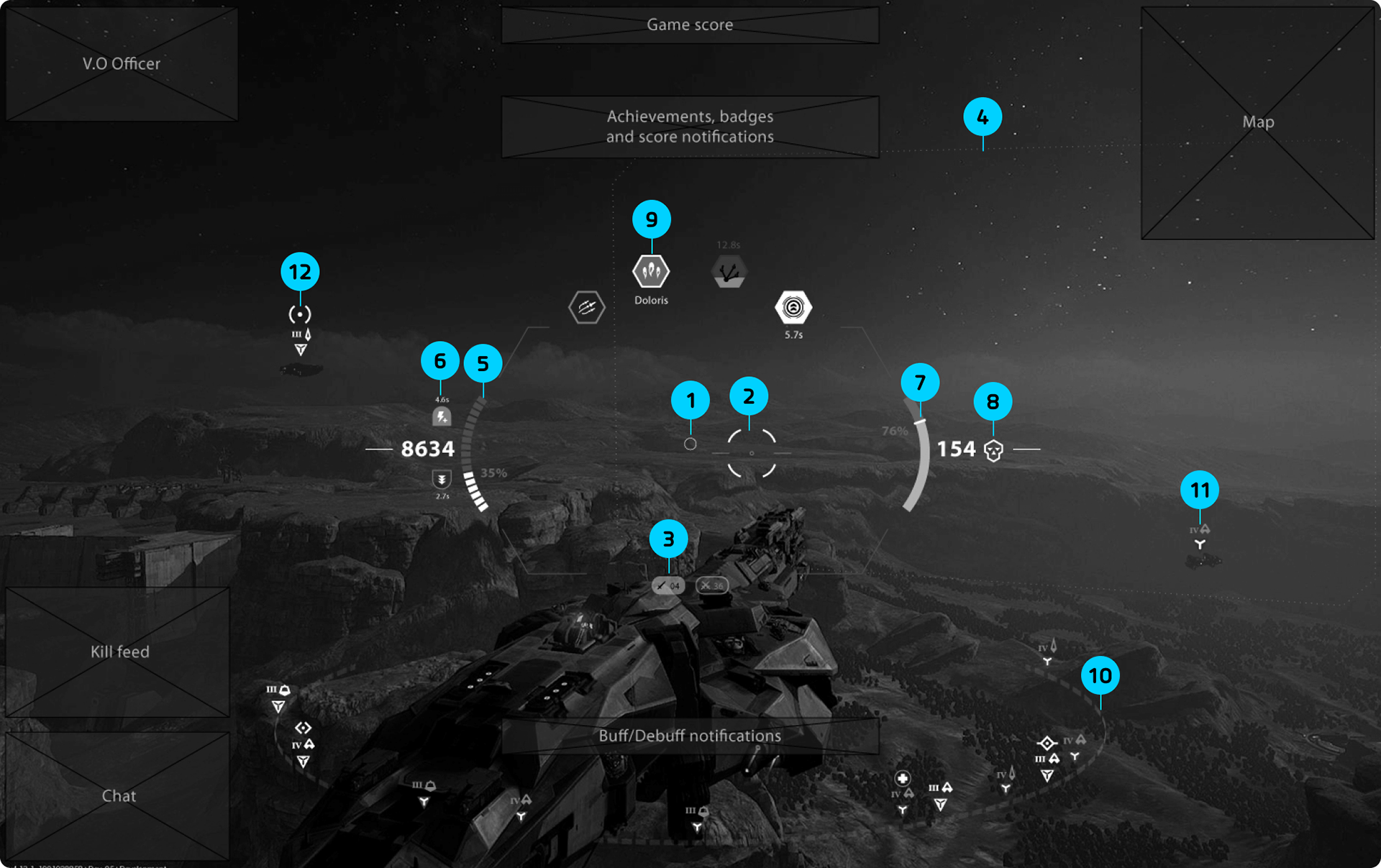
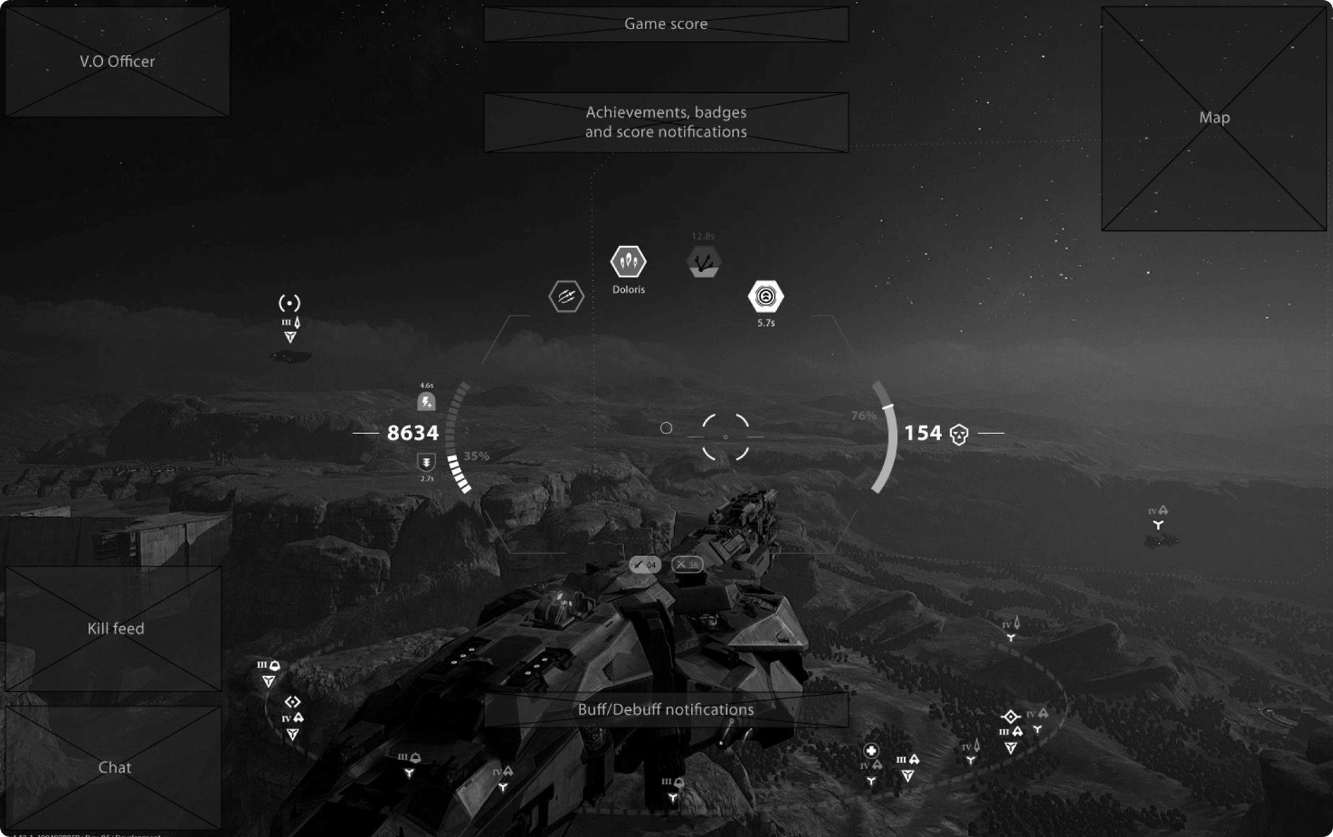
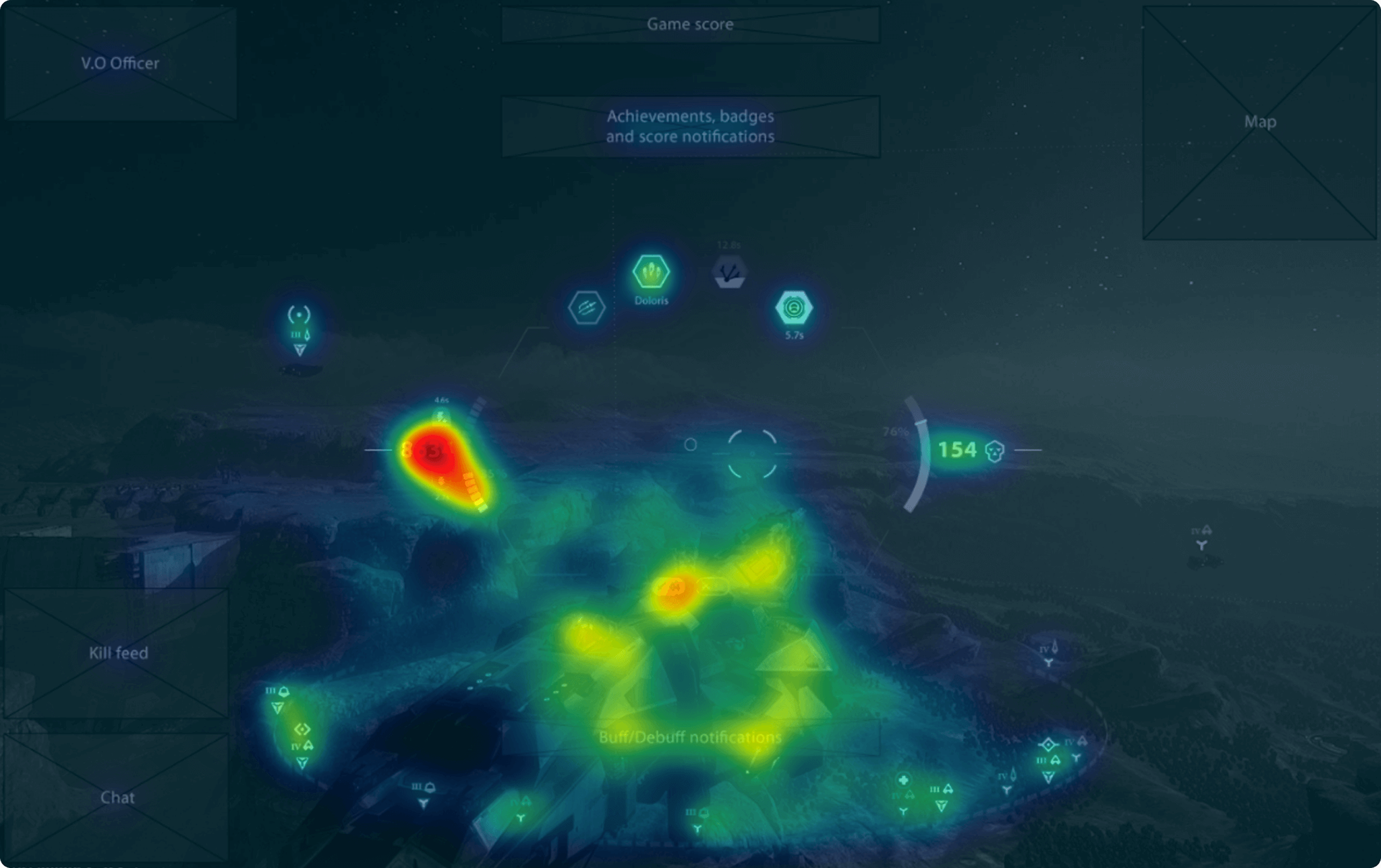
The information architecture for the battle HUD was shaped around the predictable locus of attention. Our test using EyeQuant showed that the new HUD architecture (including font weight, iconography, etc) improved the distribution of player attention. Very importantly, it increased the visibility of both the mounted modules icons and the surrounding ships indicators, while maintaining the absolute requirement of the ship's eminence.

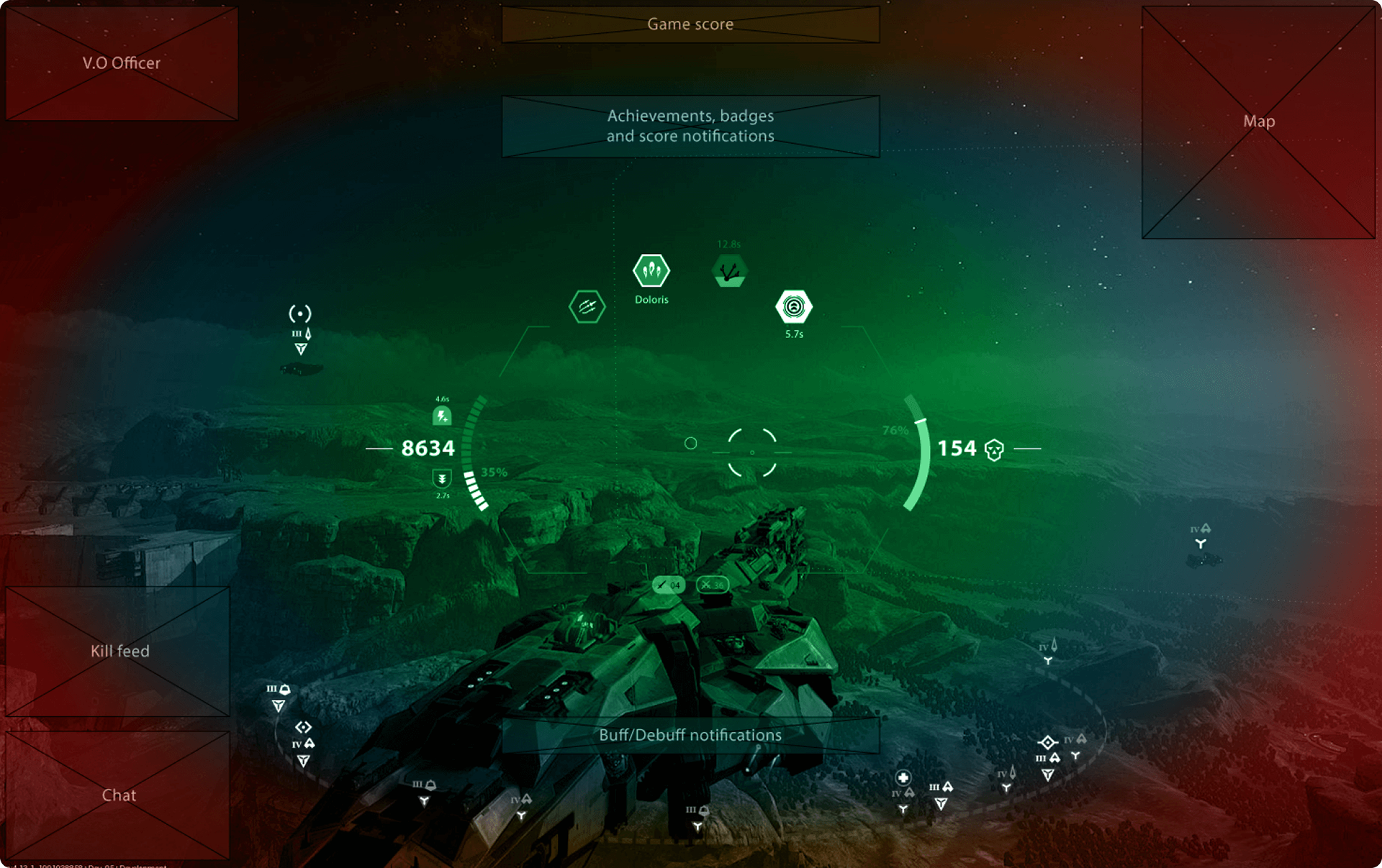
Assumption based locus of visual attention. The most vital indicators were placed within the green zone. The red zone may narrow depending on action intensity. 

The mounted modules were no more lost on the top edge of the screen, they were getting noticed.
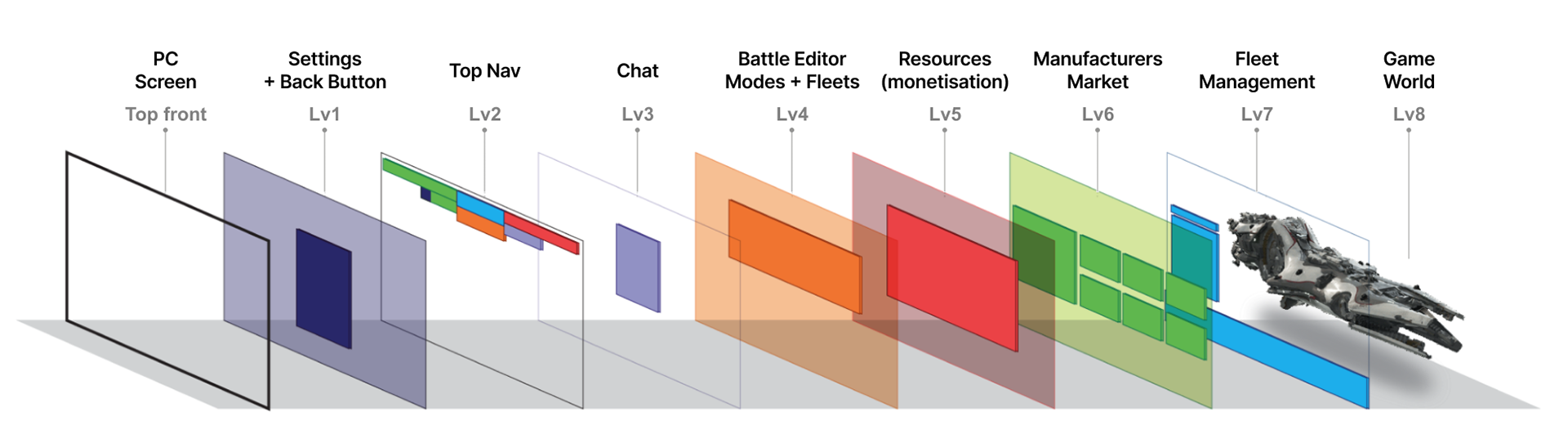
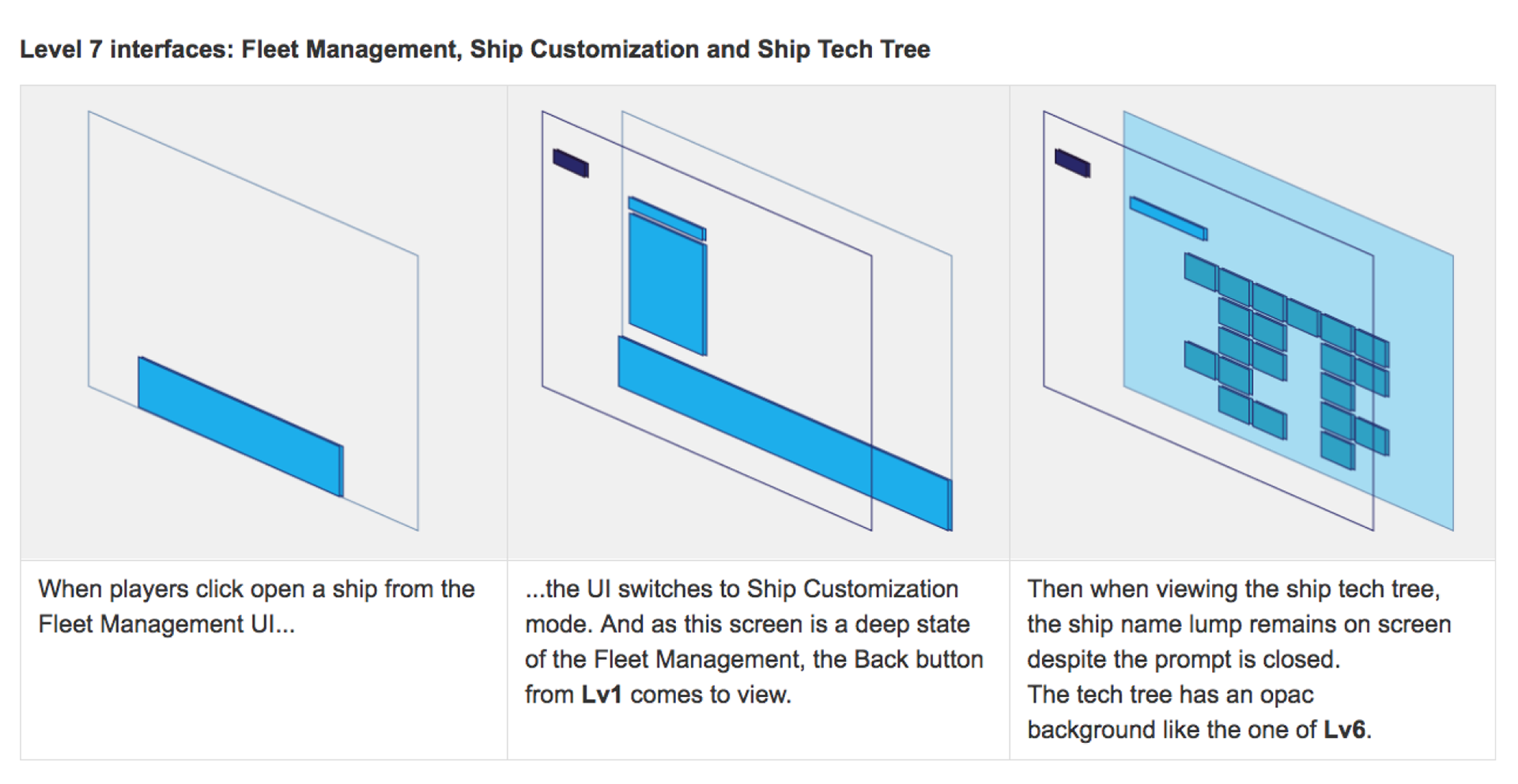
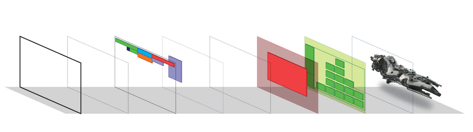

2. INTERACTION DESIGN
• The navigation bar and battle editor redesign
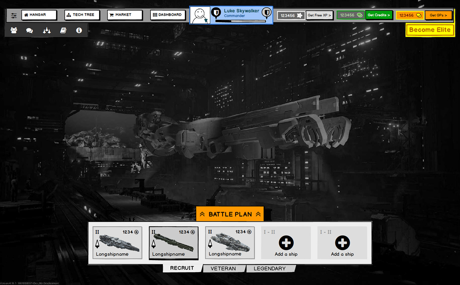
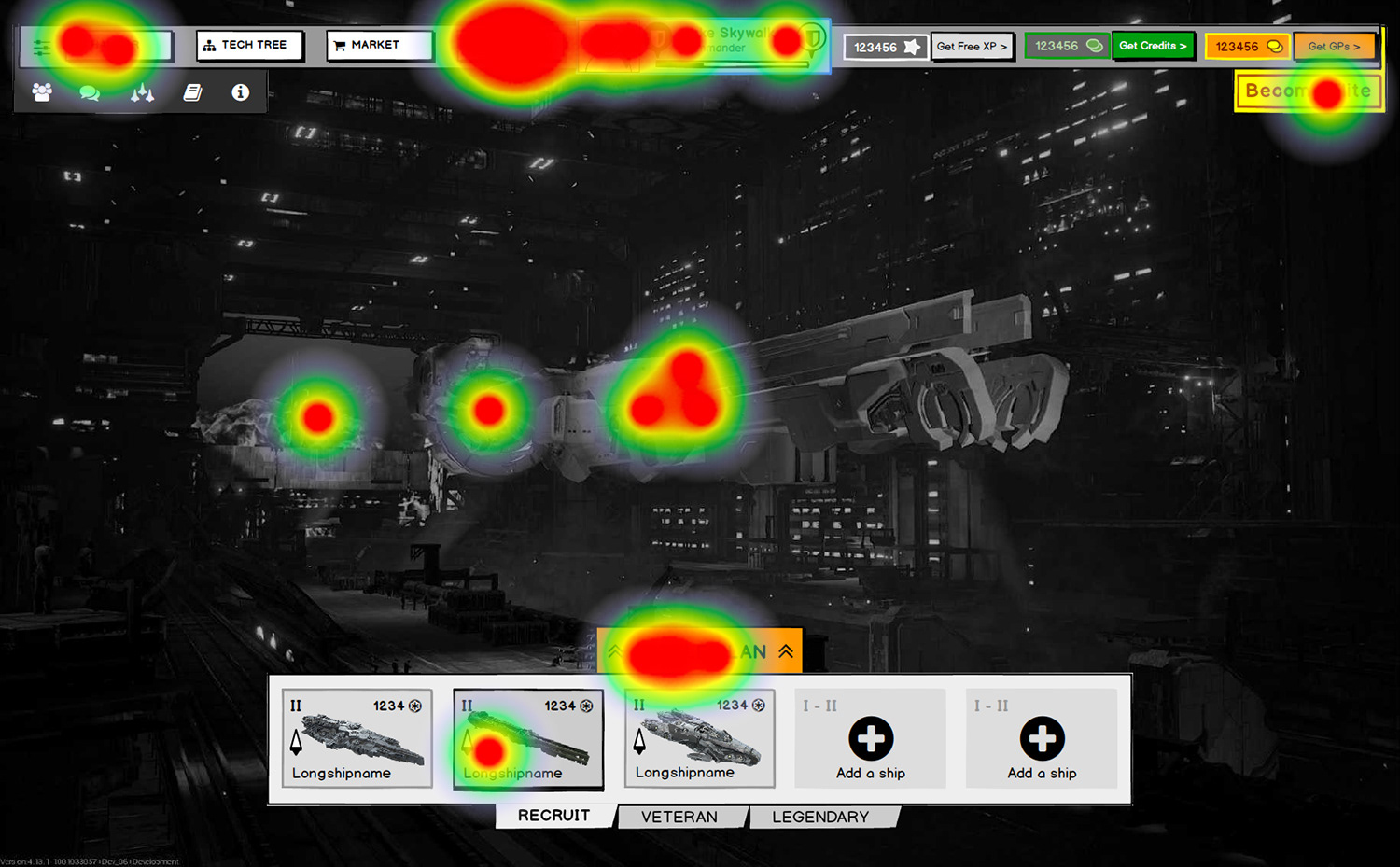
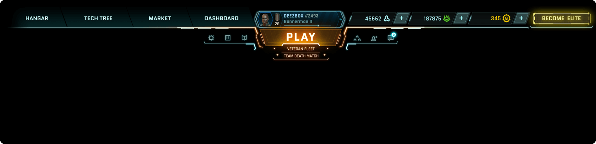
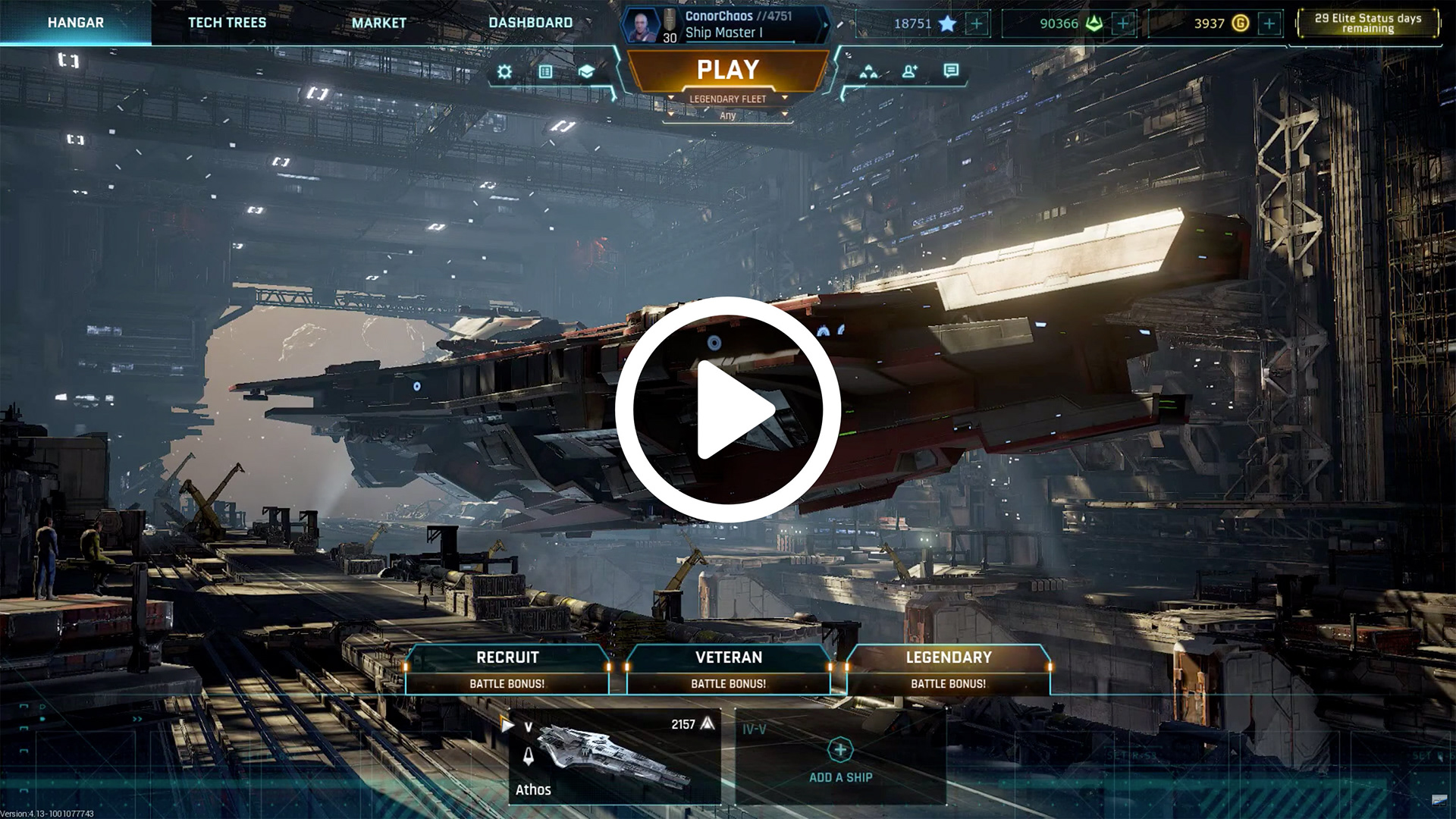
One of the first candidates for a redesign was the main navigation bar. It is the backbone of Dreadnought's pre-battle experience. The previous version had very few buttons but missed to provide access points to crucial monetization and social interaction features (Squads, Friends and Chat). Overall, the entire structure lacked a clear information hierarchy. It was in essence a group of buttons centered on top of the screen.
• Battle editor (before)
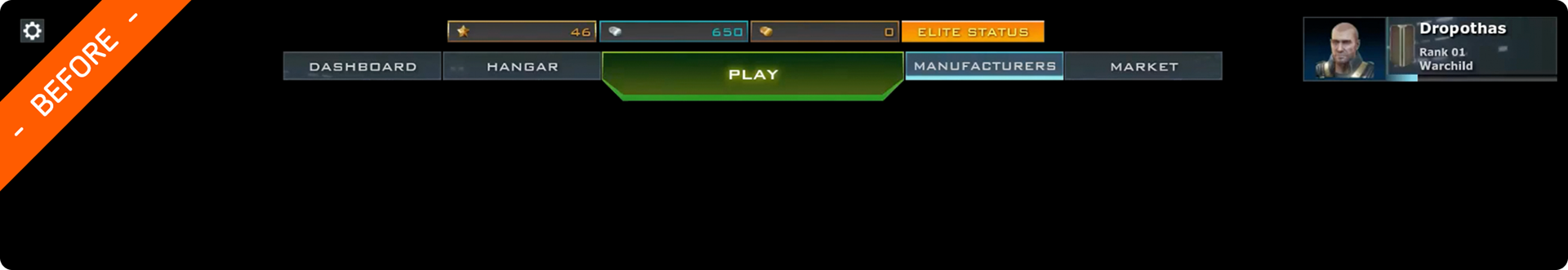
Furthermore, the Play button was in fact the access point to the game mode and fleet selection pop-up. Thus, after clicking the first "Play" button of the top navigation bar, players still had to click a second "Play" button to actually join a battle. Also, when in the fleet selection step, players had no other choice than cancelling and restarting the journey if they changed their mind and wanted another game mode. All-in-all, players had to click at least two times before joining a battle. Each time.

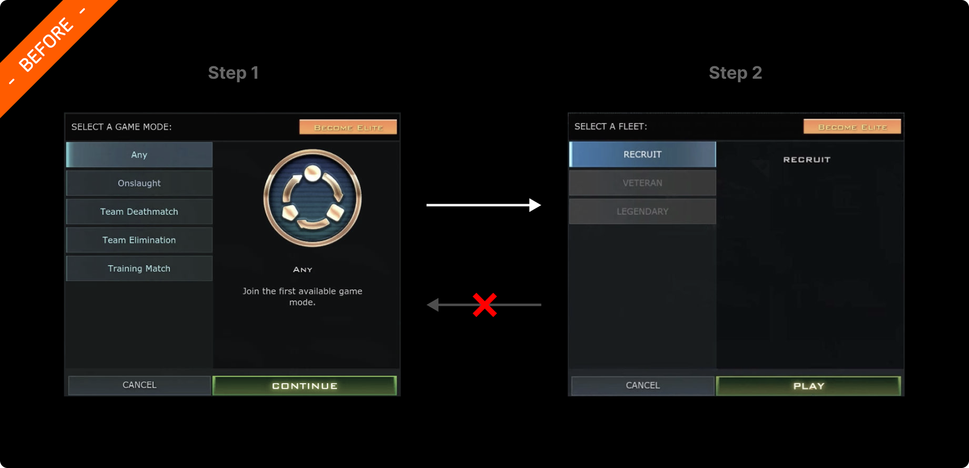
Once players click "Continue" they had no way to go back a step and change the game mode. They could only click "Cancel" which closes the battle editor.

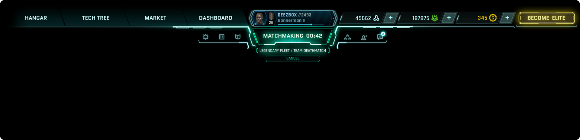
After players clicked on the last Play button, it becomes a matchmaking countdown notifier as the game searches for a match

• Researches
Following the "F" reading pattern best practice, I knew I would have to keep the left side of the bar for the core gameplay access points (e.g. Tech Tree, Market, etc). However, I wasn't sure about the best location for the Elite Status button. As a core monetisation feature, one click on it led to the Elite scheme purchase screen. It had to be easily spotted and accessed. I tested four versions (see two of the paper prototypes below).
I also explored moving the "Play" button on top of the fleets tab. The goal was to reduce the top menu information noise and its function correlated well with the fleets.
Additionally, I envisioned to make the resource scores clickable and turn them into access points. A click on the GP score lump would take directly to the GP store where players can purchase GP packs with real money. In the same manner, a click on the Free XP lump takes to the XP-to-credits convertor screen and a click on the Credit score takes to the credit packs purchase store. Converting XP and purchasing credit both requires GPs.
Last but not least, I brought the social features (Squads, Friends and Chat) right below the bar. We wanted to encourage social interaction but at this point analytics showed only a few players used them. They were lost in the central-right side of the screen, in the so called "Z" pattern dead zone.

One of the several versions I explored

In parallel to moving the "Play "button on top of the fleet tabs, I explored ways to present the entire choice of modes and fleets in one single window. The idea was to save players unnecessary clicks and of course to allow them to freely change their selection, on the go, in no particular order. The once "Play" button would become "Battle Plan". It would expand on click to reveal the game modes and PVE events. The whole would be punctuated by a single "Play" button that takes to battle for good. 
• Initial wireframing and testing
After the first scamps seemed to work, it was time to wireframe and trial further the new navigation and access to battle system. We presented an interactive mockup of the hangar to testers and asked them to click on the relevant button upon questions like: “where would you click if you wanted to edit your avatar?” 
We found out that most of the top bar was a success but we didn’t really solve the Battle Editor journey issue. The "Play" button was still buried behind a second click, and wasn’t convenient in case a player would only like to replay the same game mode with the same fleet. Not to mention, “Battle Plan” as a label wasn’t obvious enough to let testers guess that this was the access point towards battles . 
When asked to join a match, four testers clicked on the ship. One even thought clicking the hangar entrance took “outside to the battlefield"...
• Post-feedback wireframing
After a bit more feedback rounds and iterations, I finally came to the version below: I streamlined the labels of the resources buttons (e.g. Get Credits) to a "Plus" icon next to the score. This maintained the visibility of the stores access points and better balanced this group of buttons. Most importantly, I brought the Play button back-in, as feedback expressed moving it didn’t work well. 
I also came back to a two screen Battle Editor system for scalability. Although the PVE events were delayed for later releases, more game modes were in the making and I didn't want to end with an overwhelming wall of fleets and modes. However, the new Battle Editor I envisioned was very positively perceived. It was regarded as a considerable UX improvement as it allows players to switch at will between the Game Mode board and the Fleet board. Plus a simple click on Play would take straight to battle if players were happy to take the same fleet to the same game mode forever.

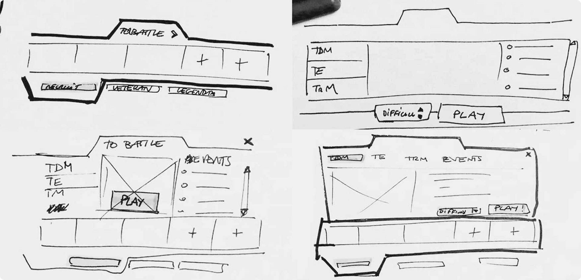
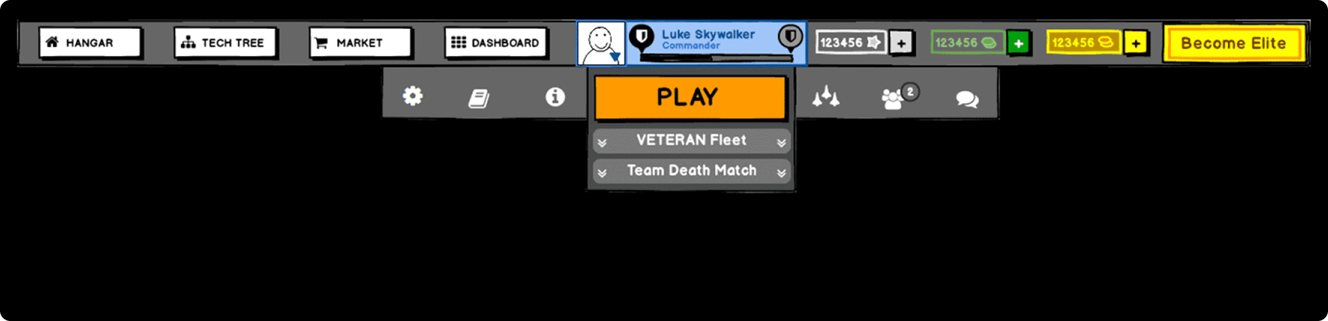
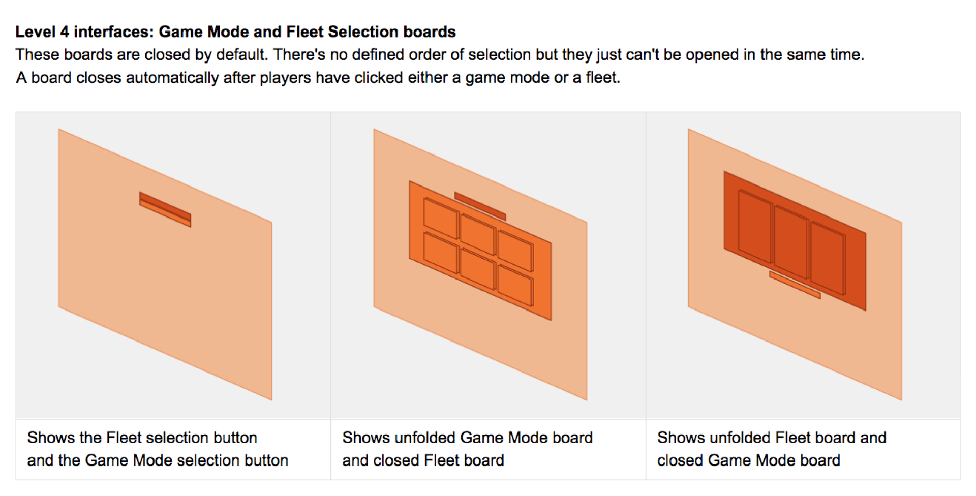
Players click on Play to join a battle with the selected fleet in the selected game mode.

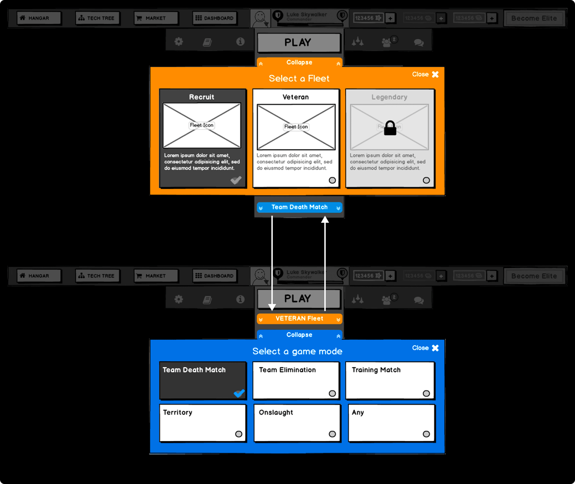
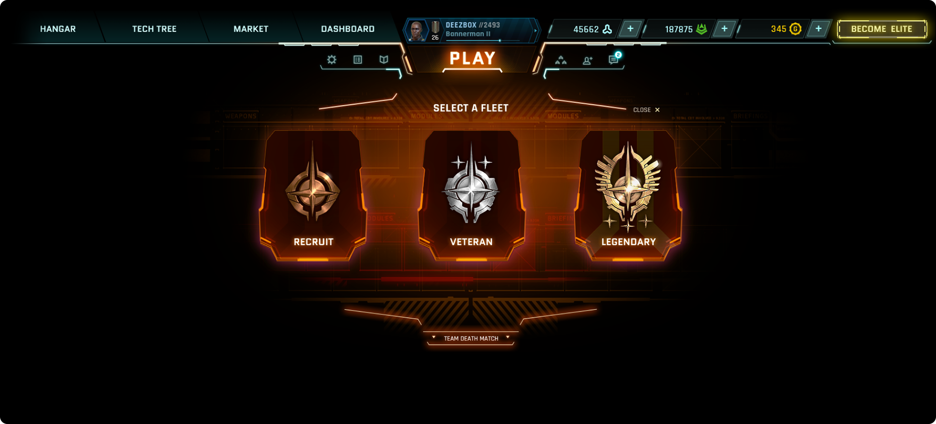
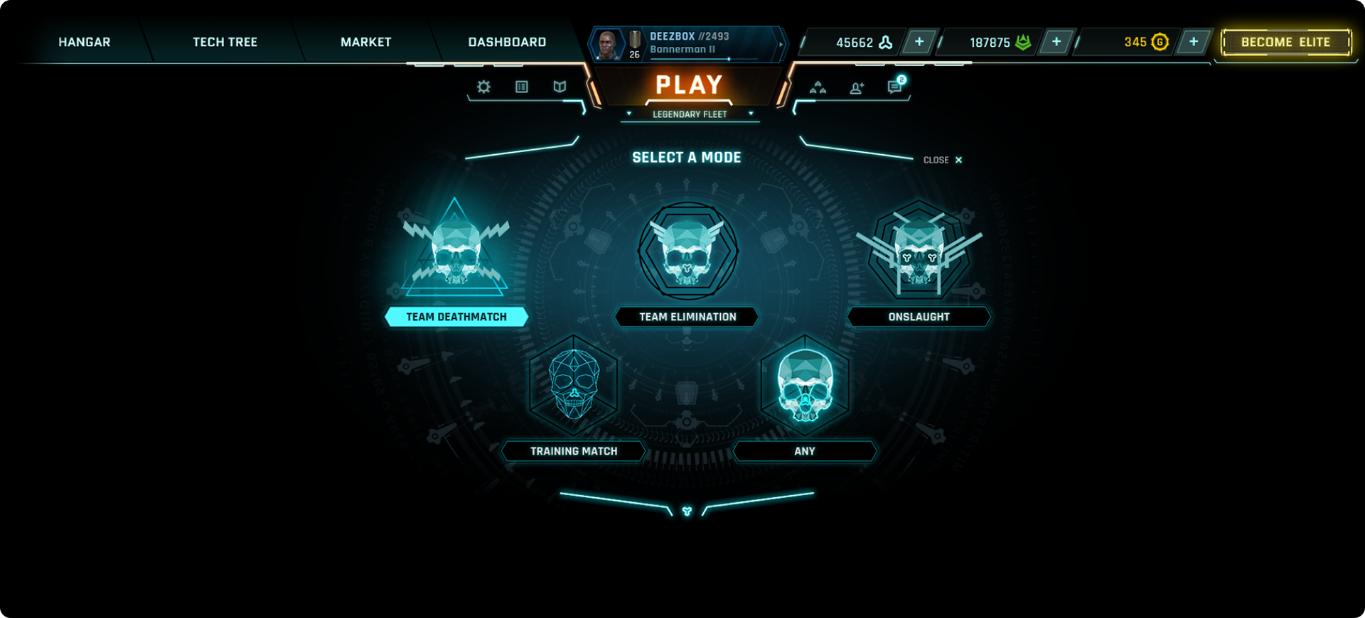
Players click on the fleet button to expand the fleet-board and select a fleet, click on the mode button to expand the mode board to select another game mode. And go back and forth, forever if needed.

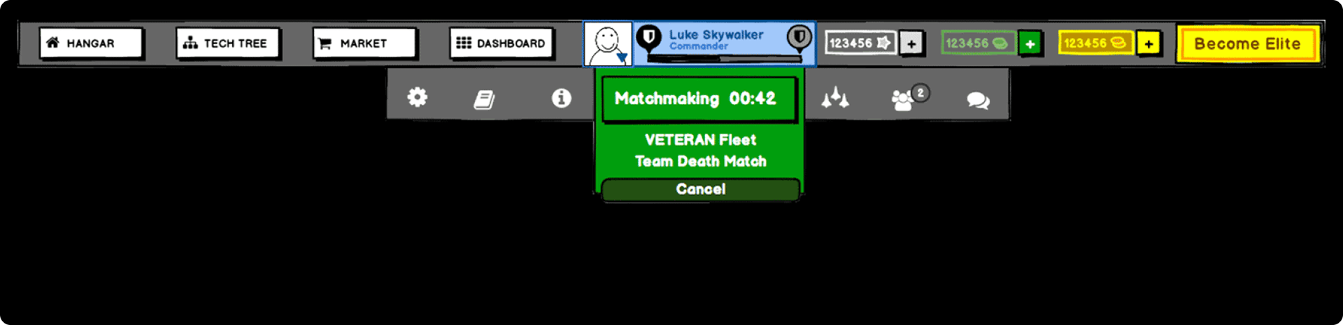
After players clicked on Play the game then searches for a match to join.

• Validation
Some testers felt that the access point to the captain profile screen was not clear; some felt that "Dashboard" should come before "Hangar" in the menu. The need for a single Battle Editor board was expressed, hence it received the lowest score. However, because of scalability this wasn't an option. But overall, since this last version received quite positive feedback it was signed off. 

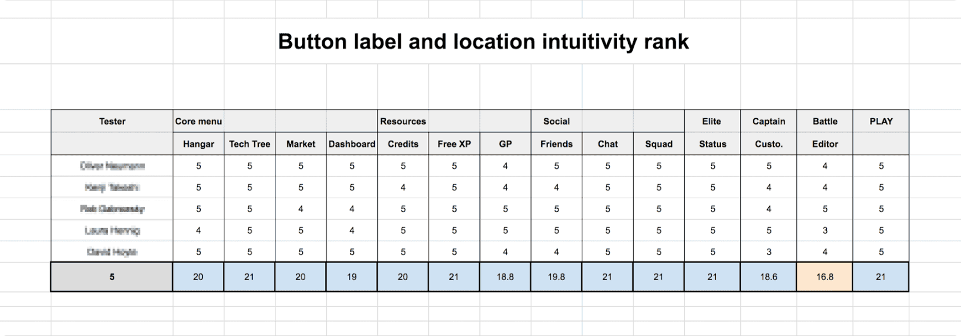
The need for a single Battle Editor board was expressed hence it received the lowest score (but it wasn't an option because of scalability)


tHE NEW Top bar
At this stage I supported the UI art with my usability and accessibility expertise. This meant improving the affordance of the access points and introducing visual articulation following the Gestalt principles. Most notably, I used my Art Director background to capture the essence of the game's lore and lead the art style towards a more appealing and immersive appearance. Here is the new UI concept for the top navigation bar:

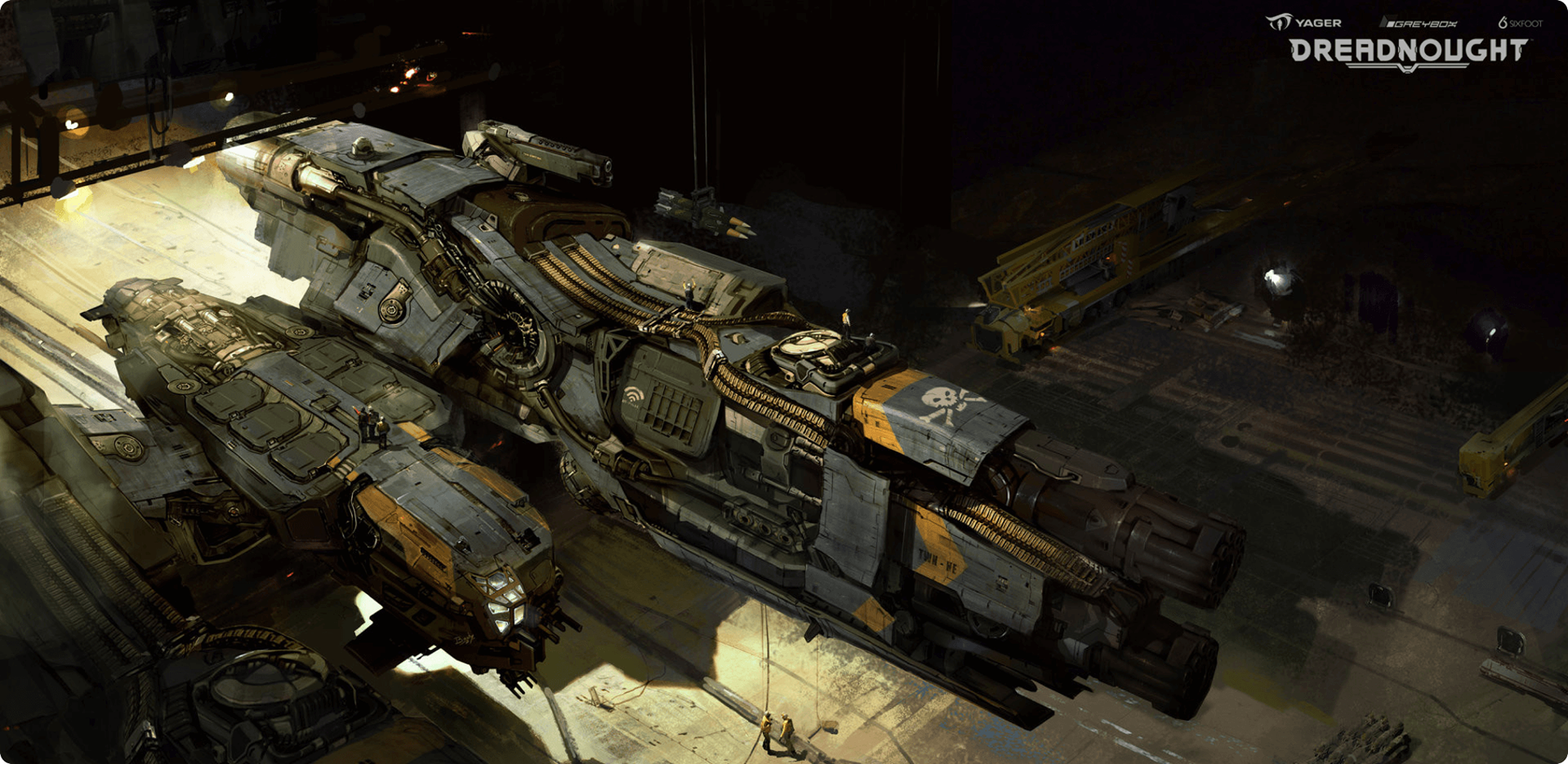
The new UI style mirrors the flamboyance of figureheads such as the Trident and the Morningstar 

Parts and details of the new UX and UI were progressively implemented following a lean approach. You can see in the video below how the new top navigation bar looked and behaved as of mid-2018.
WHAT I LEARNED

While seeking insights on our users to strengthen engagement and retention, I came across key researches on the psychology of gamers:
1. The gamer Motivation model
Gamers are not a monolithic group, their gaming preferences vary in important ways. Using survey data from over 200,000 gamers between the ages of 13 and 64 worldwide, researchers Nick Yee and Nicolas Ducheneaut identified six clusters of motivations:
• Action: excitement and destruction  
• Social: collaboration and competition
• Mastery: strategy and challenge
• Achievement: power and completion
• Creativity: design and discovery
• Immersion: story and fantasy
2. The PLAYER EXPERIENCE OF NEED SATISFACTION (PENS)
This model for player motivation and engagement applies the well known Self Determination Theory (SDT) to video games. Based on gaming psychology experts Scott Rigby and Richard Ryan decades of behavioral science research, it theorizes that sustained player engagement is fostered by a game's ability to deliver on three central axes:
• Competence: the feeling of growing, learning and progressing towards mastery 
• Autonomy: the feeling of empowerment and control, of drawing one's own path
• Relatedness: the sense of meaningful community and social relevance
These models helps define which features to improve or advertise in order to attract and retain the relevant audience.
Thanks for reading!
Back to Top